Mobile-Friendly Websites: Why They’re Non-Negotiable for Restaurants
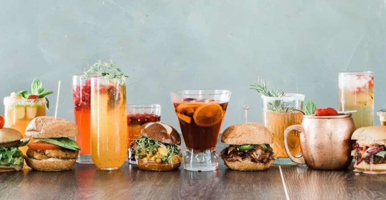
No one wants to pinch-and-zoom their way through a Sunday roast menu. Yet plenty of hospitality sites still look great on desktop and fall apart on a phone. In Chester, most diners discover, compare and book on mobile, often while walking the Rows or scrolling on the sofa. If your site isn’t mobile-first, you’re leaking bookings.
This guide explains what “mobile-friendly” really means for restaurants, pubs, cafés and bars – from design and booking UX to speed, accessibility and SEO – plus practical steps to fix it fast.
Why Mobile Matters (Far More Than You Think)
- Decision point “Restaurant near me,” “best brunch Chester,” and “cocktail bar tonight” are mobile journeys. If you’re slow or awkward, you’re skipped.
- Mobile-first indexing Google primarily evaluates your mobile site for rankings. A weak mobile experience = weaker SEO.
- On-the-go expectations Diners want opening hours, menus and booking in seconds – not five taps deep in a PDF.
- Conversion impact Clean mobile UX shortens the path from “Looks good” to “Book now.”
Mobile Must-Haves for Hospitality Websites
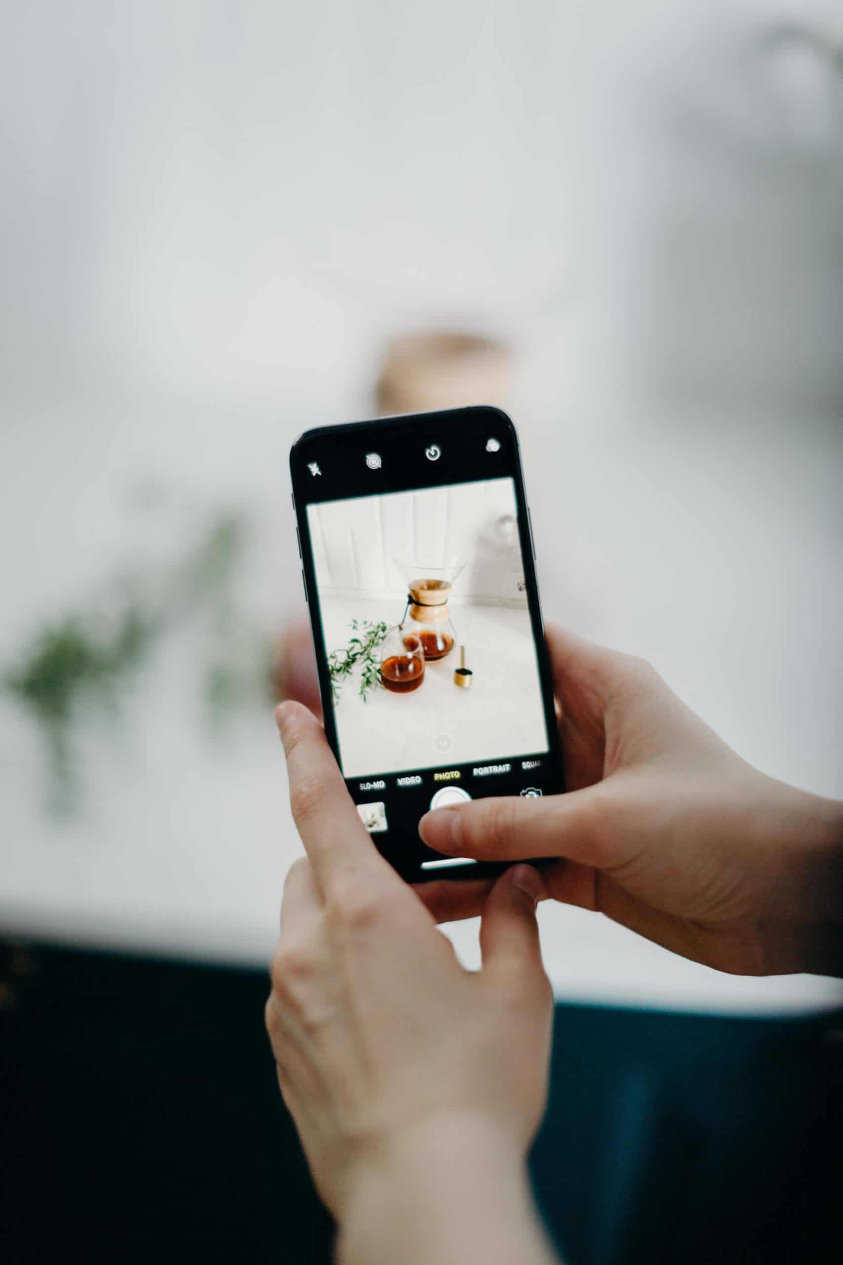
- On-page menus (no PDFs) Structure starters, mains, desserts and drinks with clear sub-headings. Use readable font sizes (16–18px minimum) and generous line spacing.
- Booking in 2 taps A sticky “Book a table” button in the header/foot is gold. Minimise form fields. Offer Google/Apple autofill.
- Click-to-call & maps Tap to call, tap for directions. Add opening hours and service notes (e.g., “Kitchen closes 9pm”).
- Fast, finger-friendly navigation Keep your primary menu short. Use clear labels (Menu, Book, Find Us, Contact).
- Accessible contrast & type High contrast on text over images; large buttons with comfortable touch targets (44px+).
- Compressed imagery Hero images and dish shots should be lightweight and properly sized for mobile screens.
Designing a Friction-Free Mobile Booking Flow
Your goal: reduce taps and cognitive load. If a hungry customer can’t reserve within seconds, they’ll back out.
- Persistent CTAs Keep “Book a Table” visible (sticky header/footer). Avoid burying it in a submenu.
- Minimal fields Name, contact, party size, date/time. Extras (notes, occasion) should be optional.
- Real-time availability Prevents back-and-forth and reduces no-shows when paired with email/SMS reminders.
- Mobile wallets & deposits If you take deposits for peak times, support Apple Pay/Google Pay to speed checkout.
- Post-booking UX Clear confirmation screen, calendar add and directions link. Consider an upsell: “Add pre-theatre menu?”
Need help picking a system? See our comparison guide: Best Online Booking Systems for Restaurants and Pubs in the UK.
Speed on Mobile: Core Web Vitals That Matter
Speed isn’t just “nice to have”, it’s critical for bookings and SEO. Focus on these:
- LCP (Largest Contentful Paint) How quickly the main content appears. Aim < 2.5s on mobile.
- CLS (Cumulative Layout Shift) Avoid elements jumping around as things load (e.g., buttons shifting).
- INP (Interaction to Next Paint) How responsive your site feels when users interact.
Quick wins compress images, lazy-load below-the-fold content, preconnect to critical domains (booking widgets) and use quality hosting with caching/CDN. We cover more here: How a Slow Website Could Be Costing Your Pub Customers.
Mobile Accessibility: Hospitality Is for Everyone
- Contrast & readability Ensure text passes contrast checks; avoid text over busy imagery.
- Keyboard/switch navigation Menus and booking widgets should be operable without a mouse.
- Alt text Helpful descriptions for images (especially dish shots).
- Motion sensitivity Keep parallax/auto-playing video optional to avoid nausea and save data.
Accessibility widens your audience, improves SEO signals, and reflects real-world hospitality online.
Test Like a Diner: A 10-Minute Mobile QA Checklist
- Open on 4G and Wi-Fi — does the homepage load within 3 seconds?
- Can you find the menu in one tap? Is it on-page (not a PDF)?
- Is “Book a Table” always visible? How many taps to confirm?
- Do opening hours, address and Google Map load quickly?
- Try the site with one hand – are buttons large enough?
- Reload the menu page – does content jump (CLS)?
- Check a popular phone size (iPhone/Android). Any text too small?
- Add a booking to your calendar from the confirmation screen.
- Turn on Dark Mode – does anything become unreadable?
- Pass a quick accessibility scan (contrast, alt text, focus states).
Common Mobile Pitfalls (and How to Fix Them)
- PDF menus Replace with HTML pages and anchor links; keep PDFs only as a downloadable backup.
- Hero videos Heavy and distracting. Use a single optimised hero image on mobile.
- Overloaded navigation Cut to essential items. Use footer links for the rest.
- Third-party widgets Booking/Instagram feeds can slow pages. Load them after core content (defer) or on dedicated pages.
- Tiny tap targets Increase button height and spacing; avoid placing CTAs too close together.
For the full foundation checklist, read our hub guide: What Every Restaurant Website Needs in 2025 (Menus, Bookings & More). If speed is the pain point, start with: How a Slow Website Could Be Costing Your Pub Customers.
Mobile-friendly isn’t a box to tick, it’s how modern diners experience your brand. From lightning-fast load times to two-tap bookings, we build websites that turn hungry scrolls into confirmed covers.
Snack That Media specialises in Website Development & Hosting for pubs, restaurants and cafés in Chester and across the UK. Prefer a health check first? Book a Full Digital Audit and we’ll map your biggest wins.